FamilyHub: “Stay close, even miles apart.”

Introduction
FamilyHub is a mobile application designed to help families coordinate events, make polls, share moments, and ultimately stay connected.
Motivation
When we first came together as a group to brainstorm ideas, we discovered we all shared experiences as college students of feeling disconnected from family members who are miles away from us. Our specific interests lay in helping facilitate more interactions with different family members and providing organizational tools for family scheduling. Thus, the idea of FamilyHub — a social media app for people like us and their families — came forward.
Existing family management tools often fall short in addressing the unique needs of large or scattered families. While some platforms offer basic scheduling capabilities, they lack intuitive features tailored to the dynamic, diverse demands of different families. To bridge this gap, FamilyHub aims to provide a centralized hub for coordinating schedules, archiving memories, and facilitating communication among family members.
Our design process involved iterative ideation, user interviews, and prototyping to ensure our app aligns with the interests and preferences of our target user group: people looking to stay close with their families. By actively involving users in the development process, we aimed to create a family management tool that not only addresses current pain points but also adapts to the separate needs of different families.
Our Approach
When the idea was first brought to the table, we conducted interviews with multiple users in our target user group. This gave us more insight into their experiences with keeping in touch with their families and what applications or tools they used to do so.
Here are some questions we asked in the interviews:
- Do you need to take your family into consideration in your daily routine, and if yes how so?
- How does the distance you live from your family affect your communication with them?
- Can you walk me through the planning stage of a family gathering?
- Can you walk me through an example of an app you use to plan things with your family? Are there any frustrating features or particularly useful features?
- What do you think would be nice to have on an app to streamline communicating or planning events with family?
- Do you like having a flexible versatile app or just something reliable and consistent?
Here is the insight we received from some of our informants:
Informant A is a parent with three children, two of which are out of college and living away from home and one who is still in college.
- When her family is home, her daily routine involves cooking dinner, with breakfast/lunch being up to the individual.
- Her children do not call or message much. She worries about her kids’ safety, if they have warm clothes, etc. but does not want to bother them by messaging them when they are busy.
- Often plans for some family events or travels so everyone can be together. Takes in the input of family members.
- When communicating with family she sends pictures from trips, meals, hiking/running, but tries to not message too much so her kids don’t feel annoyed.
Her preferred interface is WeChat, which she believes is simple, easy to use, intuitive for finding things.
Pros of WeChat:
- Most used app for communication to connect with family/friends.
- Can give likes and comments or just know what’s going on in the person’s life.
Cons of WeChat:
- Can post travel pics, but cannot send to a specific group chat so that people can choose to click on the tab to see it.
Informant B is a college student who is close distance-wise to his parents, but typically doesn’t visit. He has three siblings: two older, who live on their own, and one younger.
- Last family vacation, they went to the beach. He says the trip would have been better if the rest of the family was there (two siblings were missing).
- Because he is in college, he doesn’t see or talk to family much.
He mentioned that he talks the most with family on Discord, and his sister sends him memes on Instagram.
Pros of Discord:
- Can interact with multiple “servers” of people, and receive separate notifications from each of them
- Customizable profile
- Intuitive for younger generations
Cons of Discord:
- Not as intuitive for older generations
Pros of Instagram:
- Can see photos and updates from family members easily
Cons of Instagram:
- Doesn’t use the story or messaging features.
- Instagram is mostly a mobile app, so he prefers Discord more because it can be used as a desktop app.
Synthesizing Findings
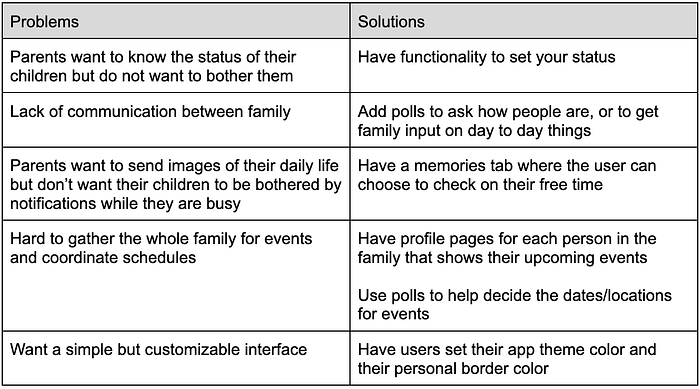
With a better understanding of our target user group, we conducted more interviews. In doing so, we were able to gather information on what features users would like to see to facilitate family event planning and communication. We noted what interviewees commented on — good and bad — when they walked through apps they’d use most often to communicate with their families. Outlined below are some of the primary user needs and wants considered for our later designs:
Low-Fidelity Prototyping
Now that we had our findings, it was time to move forward with sketching out some design ideas. Together, we decided that there were a few functionalities that we felt were essential to our design: creating calendars, performing wellness check-ins, and sharing pictures. With these necessities in mind, we were now ready to create a few low-fidelity prototypes.
Because we had four group members, we decided to split up into pairs. Each pair would create their own prototype based on the functionalities mentioned above, and afterwards, we would come together as a group to discuss which implementations of the functionalities that we liked, and what we wanted to change. The goal was to explore separate ideas and later further develop the components that we thought worked best for our goals. We wanted our prototypes to be very basic and focus on layout and functionality rather than aesthetics.
Prototype 1
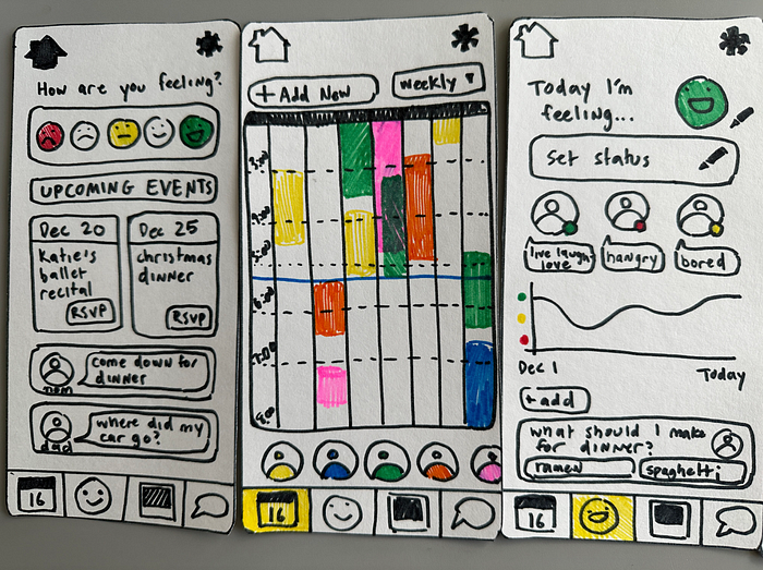

Our first prototype implemented the features by creating a separate page for each of them. Our home page gives the user a general summary of all the information the app provides, such as upcoming events and latest messages.
We also created a calendar page, where events would be displayed. The idea was that each user in the “family” group had their own assigned color, and with the calendar, you could see at a glance what everyone’s availability was. You could also toggle event visibility by clicking on a user’s icon. Next, in the check-in page, you could set your status, view other users’ statuses, as well as view a graphical representation of how your mood progressed. We wanted the user to be able to log into the app every day, answer a short question about their mood in the home page, and save that data to be used later. Finally, we added photo sharing and messaging features in the form of a gallery and a chat room similar to iMessage.
Importantly, we also wanted the app to be easily accessible, so we decided to have joining groups be implemented through scanning a QR code rather than a login process.
Prototype 2

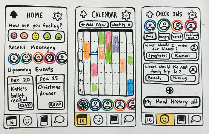
The second prototype had similar ideas to the first: A navigation bar at the bottom, along with other pages for a calendar and chatroom. The difference was that the first prototype had a separate page for the check-in, while the second prototype integrated the status-setting functionalities with the homepage. We thought about making the important information such as status and recent messages more visible at a glance. The upcoming events were also displayed as a timeline rather than a list.
We also decided to put more emphasis on user icons rather than colors. For example, calendar events were labeled with user icons to indicate the particular user that created the event.
User Feedback/Evaluation
After we were finished with our two prototypes, we found two evaluators that fell in the project’s user group: Individuals who keep in contact with their families. One of the evaluators was a (self-described) “newly middle-aged woman who is always in charge of organizing everything family related”, while the other was a college-aged student who agreed that they “[kept] contact with [their] family most of the time”.
After evaluation, it became clear that a combination of the two designs was preferable, with certain elements (ie. poll feature and event RSVP) being more attractive or readable. Thus, for our revised prototype, we decided to emphasize tasks oriented around planning and communication.
Our vision for improving the design rested on building desirable features (such as a customizable user status) and improving visualizations. We altered the color-coding idea of the first prototype so that every user had their own border color as well as an icon. We also implemented other changes, including re-ordering the home screen for better task flow and decluttering the check-in screen.

High-Fidelity Prototyping
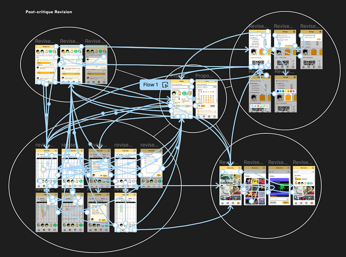
Turning poster paper to Figma, we translated our low-fidelity prototype to a digital surface. We took our initial, static prototype to a class studio, where we could gather the opinion and impression of our peers. We also performed a live revision (first revision) of our prototype as we discussed the feedback we received. Several key takeaways from this studio: we needed to tune our design for more pragmatic, general tasks, and flesh out the interactivity of our prototype.

Some key notes we gathered:
- Classmates noted that several features, such as polls and overlapping calendar events, seemed useful, and they wanted to see more information such as poll statistics for better consensus building.
- The chat feature was recognized as redundant.
- Some wished for the ability to create new groups for their friends.
- We found that our design needed a bit more interactivity and more flow between pages. For example, we needed to think more about how you would set up a family, how you would join a family, and how users could switch between different families.
- It was also suggested that we should think about the age of the target demographic, since younger children typically do not own their own mobile devices.
On the visual side, our peers generally liked the layout and aesthetics of our app. However, we could have played around more with accent colors and refined the prototype to appear more native to mobile apps. In the initial prototype, we had a single accent color along with monochrome tones, so to add visual variety, we adjusted the saturation and brightness of accents in later revisions. The lo-fi appearance of our initial prototype came from the overuse of element borders. Using drop shadow or color distinction helped elements pop more naturally, just like in native apps. Overall, clarity and interaction specificity were good goals for the final revision of the high-fidelity prototype.
Our Implementation
We decided to take FamilyHub from Figma to Next.js. Building our Next.js app challenged us to find an efficient, consistent way of implementing the breadth of interactivity imagined in the high-fidelity prototype.
Next.js and our Development Strategy
Next.js is a React framework, which provided us a strong foundation for our implementation. The project structure helped divide the app into manageable chunks, and we could centralize our frontend and backend development. As such, our strategy for each feature was to start both the backend and static implementation, merge the two, and refine.
The (not really) Backend
The team decided to work with a mock backend, so we could leverage React states and context to provide an easy way to maintain instance-independent global state management. In Next.js, we created our own context provider, wrapping the entire app, which drilled its data into different features. This meant no more reading and updating finicky, local JSON files, and it also meant we could simply refresh our app to reload our demo with session-independent data.
Building Components (with more components) and Static Pages
Starting with static implementation helped us nail down the interactivity of our app’s pages and features. We encapsulated and abstracted elements, such as our app’s header and navigation bar, into importable components. Working with React meant our project could also take advantage of the wealth of free(!), open-source libraries installable through npm. Material UI and date-fns helped us rapidly produce our initial implementation prototype.
Merge Step and Additional Evaluation/Study
The merge step of our strategy is where static, local app states meet the backend. This means all data, such as events and polls in FamilyHub, are well connected between pages. Furthermore, this step served as an opportunity for thinking about our demo narrative. We also evaluated if a given narrative or task flow could work well with our current iteration of development. For example, we decided to simplify our calendar feature into a list of events, sorted by upcoming priority. The feature in its Lo-Fi, Hi-Fi, and initial implementation felt closer to When2Meet, but more difficult to use. When we populated our global data, we found that events were not very accessible when rendered. The app is contained in a mobile frame, so the visuals of the calendar felt unreadable.
A constant issue in our design is friction. So, when approaching an in-class studio user study, our motivation was testing how user interaction differed when facing more popups. We performed a barebones test between two interfaces, where changing status and creating a poll would be locked behind a popup in one of the interfaces. After asking testers to set a status, vote on two polls, and create two polls, we came to an interesting conclusion.
While the results we acquired were not statistically significant, the observational data was valuable. We anticipated that popups would generally increase the number of clicks and time needed to perform an action, providing unwanted friction. Obviously, the number of observed clicks increased. However, we noticed that the time it took to switch between different parts of the task differed noticeably. The perceived ease and time it took to complete the task generally improved when interacting with the status popup. When asking users, it turns out that popups served as an important signifier of status, where the disappearance of a popup after clicking a ‘save’ button afforded the assumption that something had been done. With the original, non-popup layout, testers generally had a difficult time switching from status setting to polls since it was not clear if their entered status had been set within the app.
Thus in future designs, we decided popups will be more thoughtfully used to help solidify the feeling of ‘executing’ a task, especially within our status, poll, calendar, and memories features.
Our Final Product
We finally arrived at the final stage of creating our product — getting it ready to demo and share with the wider Penn community.
We had our work cut out for us — we wanted to make sure that the main features we highlighted in our pitch (“coordinate events, make polls, share moments”) worked seamlessly for the best immersive experience. In addition, however, we wanted to add extra features that would be nice to have, especially on a social media app, like making the app theme customizable, creating user profiles, and switching between different families. The last few weeks between analyzing user feedback and preparing for the showcase involved ironing out bugs in our main features as well as adding new ones to better support the user’s experience.
We leveraged our abilities to tackle this final stretch, and were pretty pleased with the end result.
The Home Page

Keeping in mind our user evaluation findings, we implemented the status feature following the popup design. We decided that the RSVP button would not only show on the Home page, but also reflect on the Calendar page; additionally, if the user RSVPs to an event, their icon would show up next to “Who’s coming”. We also made sure polls on the Home page directly link to polls on the Check-In page instead of being simply a visual list. With these changes, we believe the Home page better represents a connection between the other pages, rather than existing as merely a separate page.
The Calendar Page
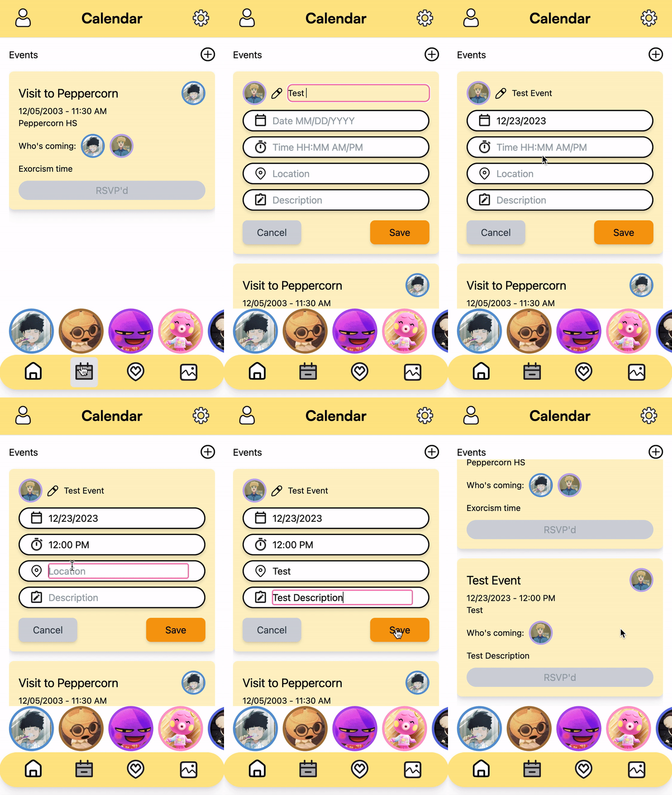
In our final Calendar design, we continued with a list visualization of events rather than a calendar. The main functionality we wanted to highlight with this page was easy access to information you’d want to see from a typical family calendar, like people’s availability in the coming weeks and their attendance status to family-wide events. With this in mind, we decided that implementing a standard calendar was not necessary and may even cause more friction in the user’s experience. We also applied design principles to improve the UI of adding a new event, as every field having the same pencil icon didn’t feel like a good signifier for their separate uses. Thus, we changed each icon to better represent the information that the user would type into each field. Finally, users can filter events by who’s going by tapping the profile photos at the bottom.
The Check-In Page
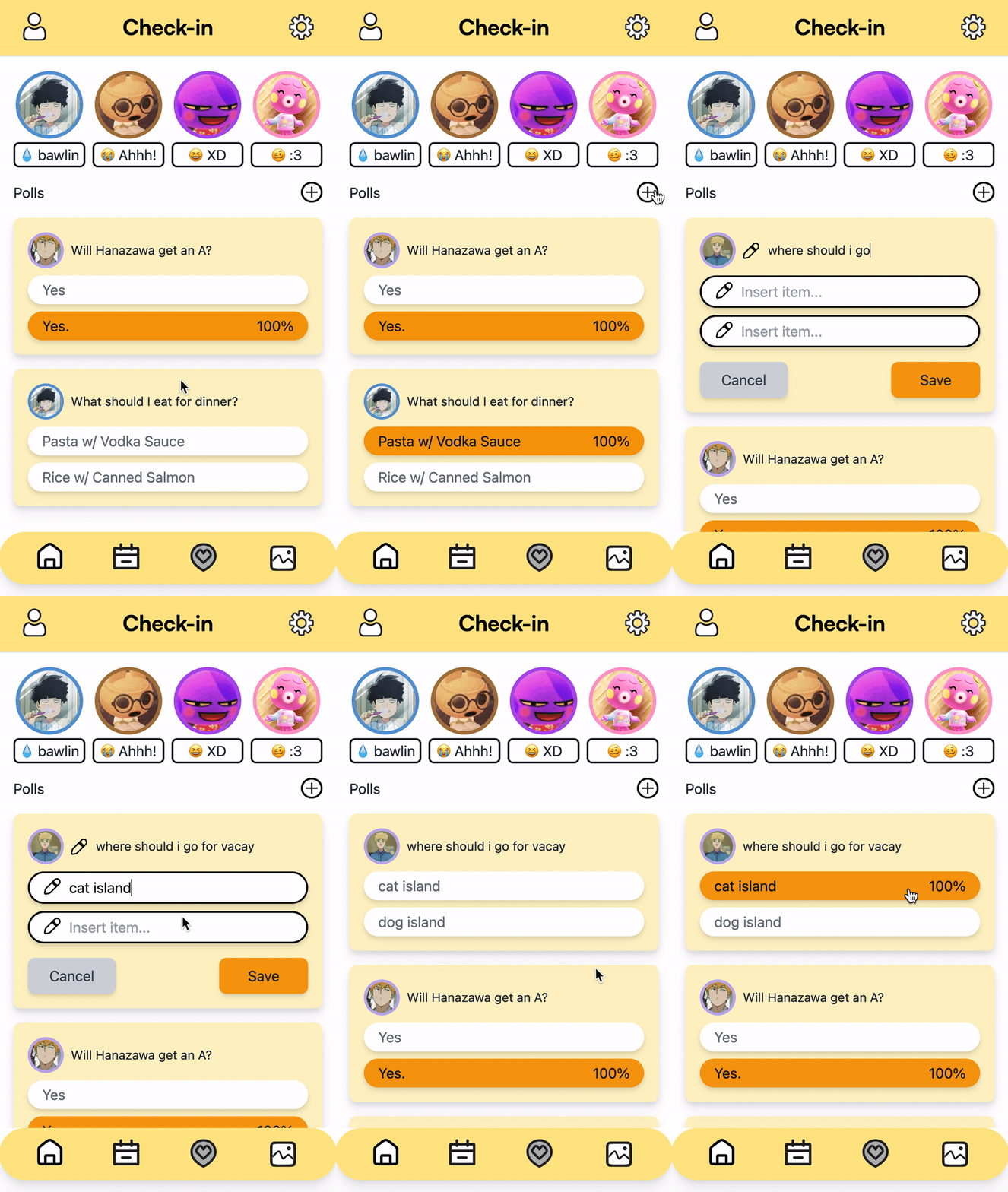
We applied the popup design to adding a new poll as well, again following our user evaluation findings. We also displayed the full statuses, emojis included, of different family members, which previously only displayed text and now more closely mimics the statuses users can set on the Home page. This page remained the most similar to our previous prototypes.
The Memories Page

In contrast to Check-In, our Memories page was arguably the page that we most had to polish for the final demo. While we connected the frontend and backend to display existing posts, our vision of adding a new post complete with a photo, title, caption, and tags wasn’t fully realized in previous prototypes. For the final showcase, we created a UI for adding a new post, making a new React component for the feature rather than just a popup to take advantage of React states. We also finalized the search feature, allowing users to quickly search for photos by their tags.
The Profile and Settings Pages
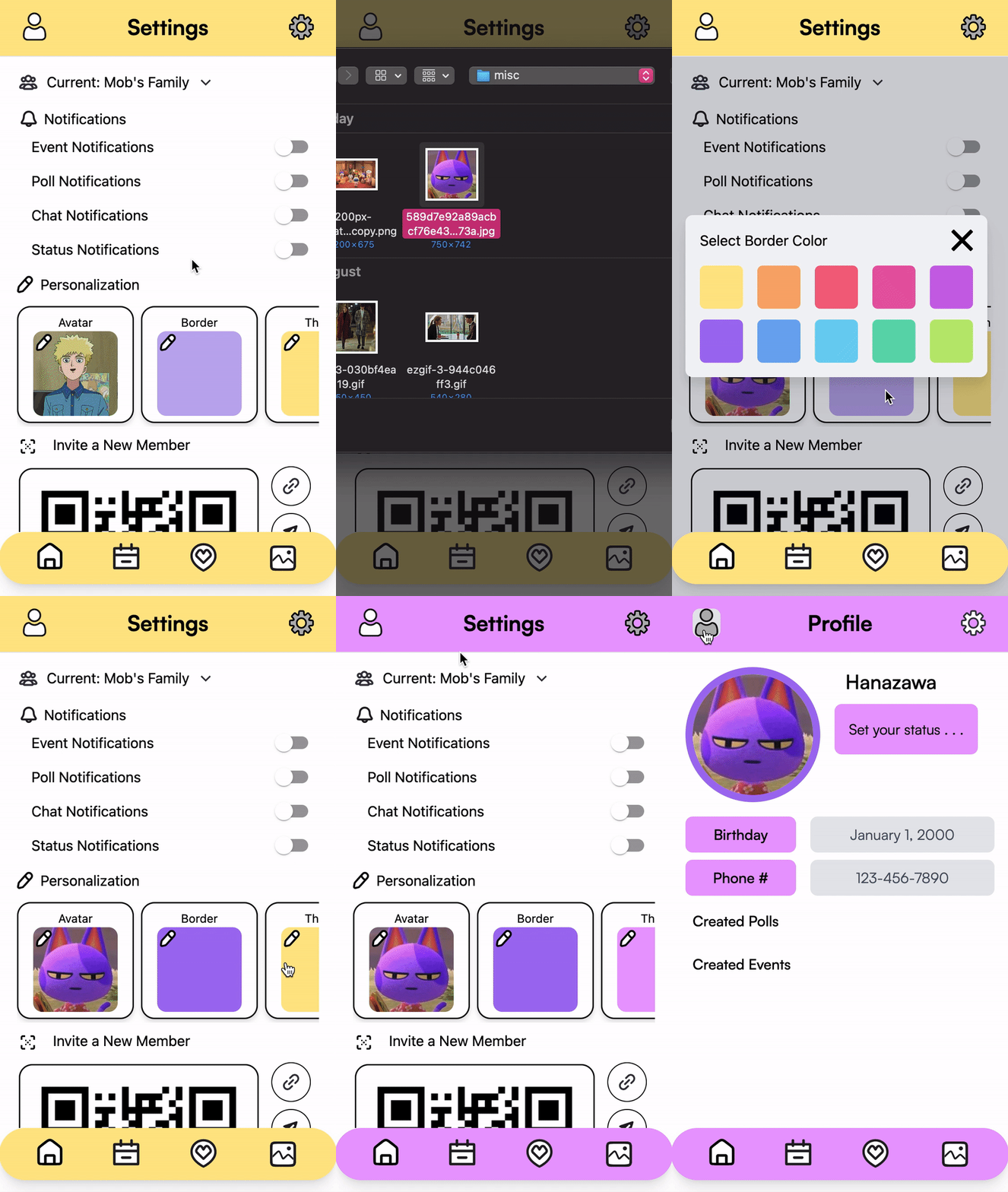

On the settings page, we made changing the user’s avatar, avatar border, and app theme fully functional. In addition, we added a profile page so that the user and their family members could see a condensed view of their profile, their status, the events and polls they’ve created, and other personal information. We also made it possible for users to create new families and “switch” families — this way, FamilyHub could be used for multiple “families”. As an example, a user could make one group for them, their parents, and their siblings, one for just them and their siblings, and maybe one for them and their friends.
Final User Evaluation

The users we presented to enjoyed the user flow of creating a poll to decide event locations, checking others profiles to find suitable times for their schedule, and conducting polls to vote on event days. Most people we presented to mentioned they had shared experiences of struggling to gather consensus when planning events with friends and family. Users appreciated the app’s affordance for managing multiple “family” groups, allowing flexibility for various social circles.
Users expressed their appreciation for the clean, simple, yet colorful and cute aesthetic of the interface. They found the app intuitive, easy to learn, and useful. Many users especially liked the ability to customize their border color and the app’s color theme in the settings. The homepage’s layout was praised for showcasing a mix of the most important and relevant information.
Ideas For Future Improvements
With the praise of our design though, we also acknowledge some areas where our design fell short. One user pointed out the inefficiency of having someone manually type out the entire time, date, and location of an event on the Calendar page. This is something that caused friction even as developers demo-ing the app, and was a significant consequence of converting the standard calendar to a list of events. In the future, we could implement a slider for choosing the date and time and an auto-filler for writing the location, for greater ease of use.
Another user suggested including more option fields for a single poll, which was something echoed by other users as well. The same user proposed automatically adding event-related poll results to the calendar or linking calendar event history with memories tags. These are all ideas we will consider for future improvements as we continue exploring this project further.
Looking ahead, other improvements we’ve discussed as a group include adding family members’ statuses under their icons in the Home page, implementing ways to filter events by weeks, and adding the ability to “react” to posts using emojis.
Conclusion
All in all, we are truly appreciative of the interviewees, users, and instructors that helped us make our initial vision of creating an app to better connect with our families into a real-life product. It was validating to see that despite the introduction of more social media and messaging apps in recent years, other people shared our same struggles and frustrations with using some of the most popular ones to communicate with family and friends — especially when there are generation gaps involved. We especially hope that college students just like us and their families will resonate with the idea and mission of FamilyHub as a whole.
